
Here I am with a new post of the WARDROBE ARCHITECT 2015 CHALLENGE series to design and sew my own capsule collection. This time we are going to talk about colours: what are the main colours of my wardrobe? What colours make me feel at ease more? How can I classify them?
As the exercises of the week 5 of the #WAChallenge2015 suggest, I started looking over:
- The pictures I selected on Pinterest and pinned in my Core Style and Outfit I like boards
- The dresses into my wardrobe
and then I caught the colours thanks to an image and graphics editor and started to put them together.
For Pinterest it was quite easy… I only had to choose the pictures with the most representative colours and caught the colour.
In the second case, I instead took advantage of this opportunity to tidy my wardrobe up (as you know this is always a tragic experience! 🙂 ) and I took some pictures of the garments I mostly wear. In this way I could have a representative catalogue of colours I prefer to wear.
These are the main 20 colours of my wardrobe:
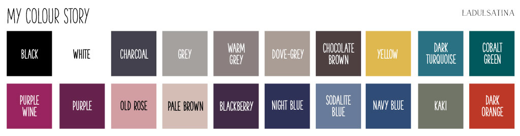
that I then classified in Neutrals, Nearly Neutrals (neutrals but with a more visual impact) and Statement colours (with a high visual impact), as the exercises of the week 6 suggest.
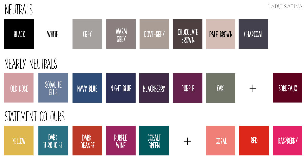
Giving a name to the colours was the most complex step, above all for some of them, since that a name is always relative. But it was necessary for me to give them a classification in order to keep them in mind. I used this website, suggested by a friend of mine, and I looked up on Google and Pinterest if I had doubts.
I realized to have a lot of neutrals and few statement colours, so I added three new colours to the “statement colours” list. Moreover I put Bordeaux in the “Nearly Neutrals” list, because it’s a nuance I like to wear (even if it’s not in my current wardrobe).
If you’re interested in colours that are going to be fashionable this year instead, here are some interesting links:
I like Strawberry Ice, Glacier Gray and Toasted Almond for spring and Biscay Bay, Stormy Weather, Cashmere Rose for fall.
In next step we’re going to talk about solids and prints, my favourite part 🙂
See you soon for updates!

1 comment
[…] amount of, etc. To analyse my colour preferences, I pulled everything out of my wardrobe and like La Dulsa Tina, I used my phone and software (in my case Inkscape) to identify colours. Below are the main 20 […]